Project Overview
Problem
My team was selected to lead the redesign of an educational website (Educational Uses of Digital Storytelling) over a six-week period, which had issues with security and was not 508 compliant.
Method
The project was completed in six weeks. It included thorough code reviews, evaluating WCAG 2.0 compliance, and conducting card sorting and usability testing.
Impact
Our team’s redesign efforts resulted in a 21% increased findability through modernizing the branding and revising the information architecture. Additionally, updates to both the frontend and backend code to enhanced security and ensured 508 compliance.
My role
As a Research & Design Assistant for the Learning, Design, and Technology program, I worked on multiple cross-functional teams to support the development and maintenance of a variety of website projects. On this project, I specialized in graphic design, WCAG 2.0 compliance, information architecture, and UX research (i.e., card sorting, usability). Additionally, I contributed some front-end code for headers, as well as back-end SQL code to extract and organize database queries for displaying the filtered content.
Process details
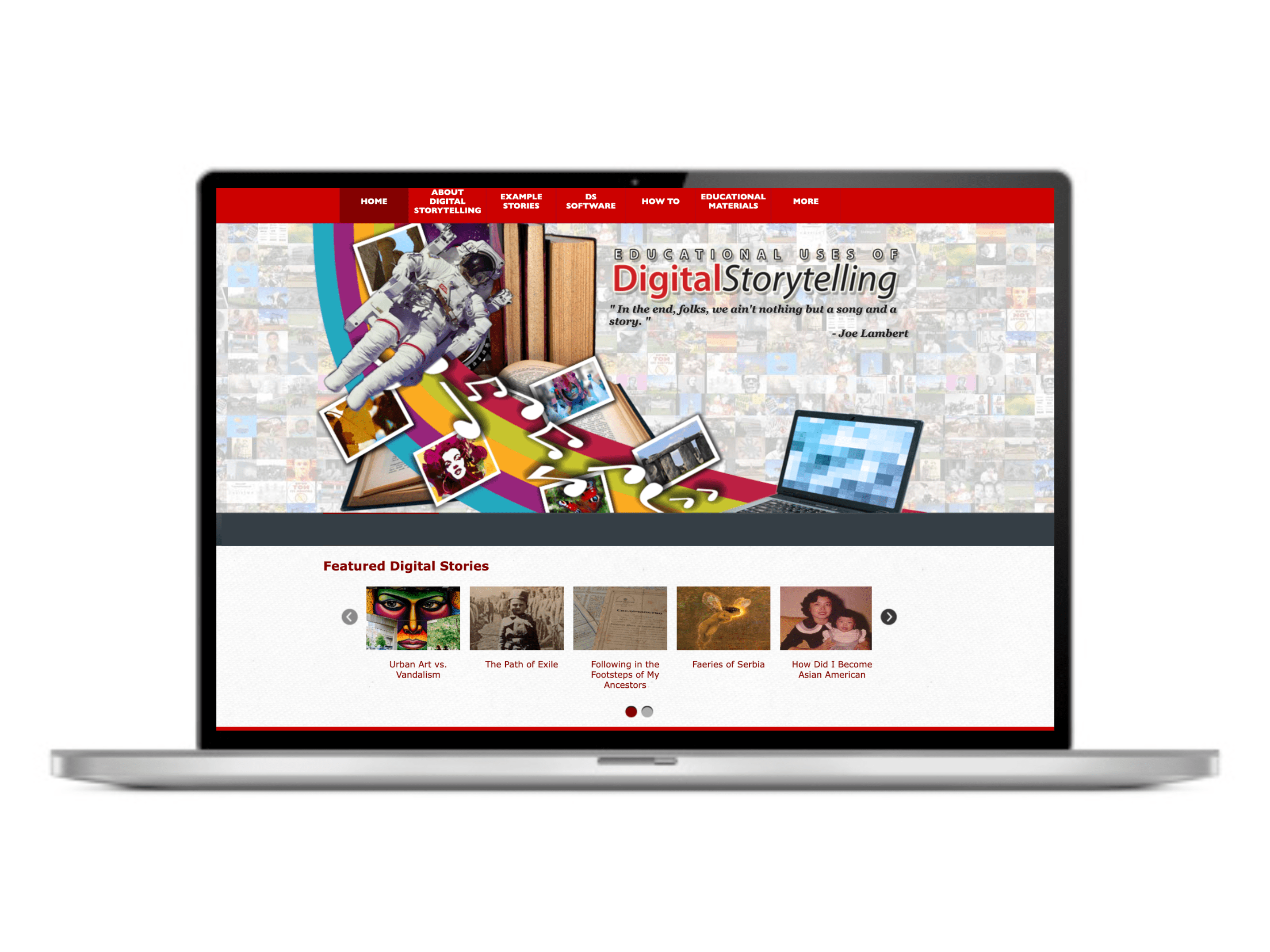
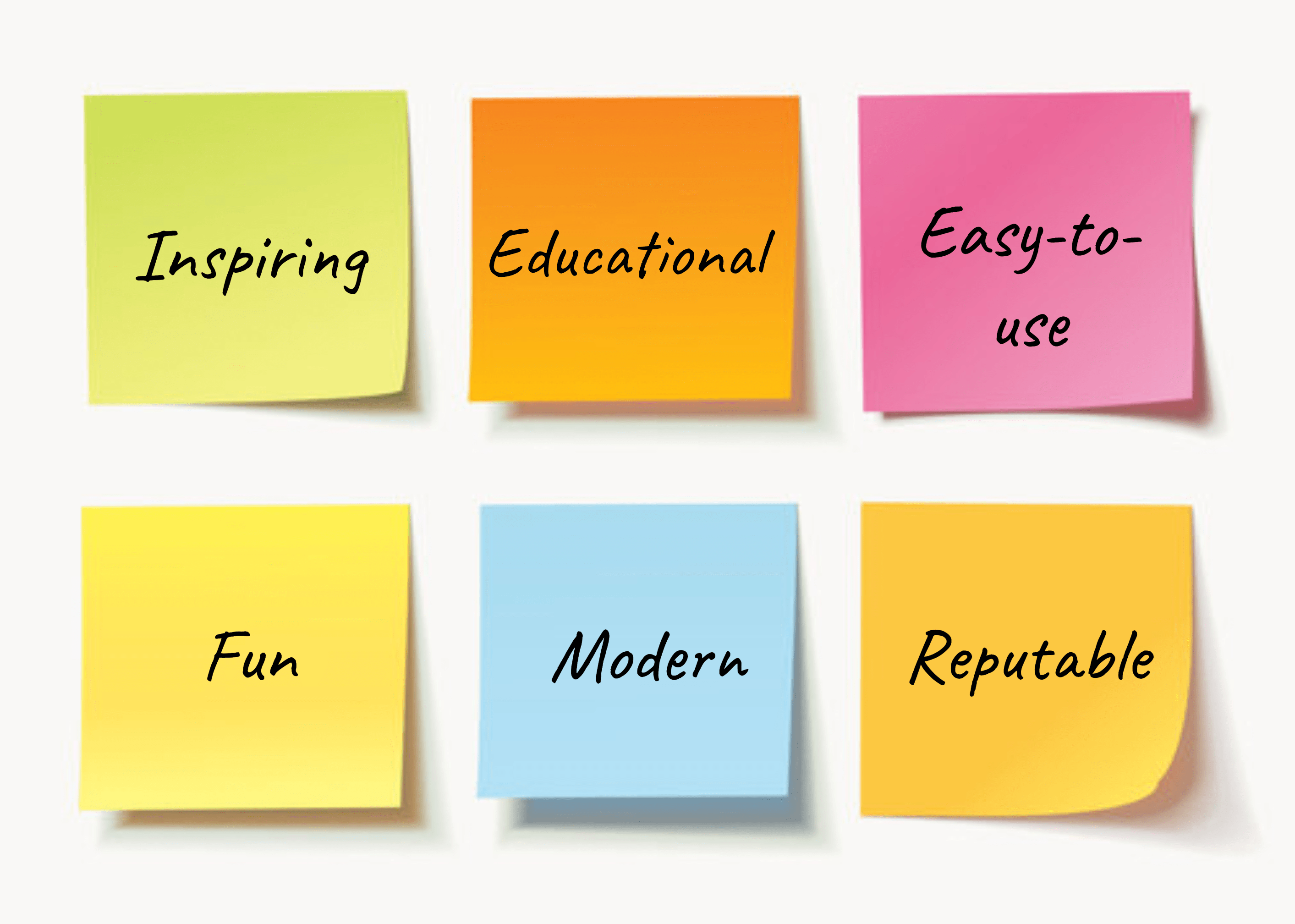
The website was initially created to curate and share short educational videos on various topics, allowing teachers to contribute content and use it in their classrooms. I began the rebranding effort by facilitating a workshop with my team and the client to better understand the vision for the website, which resulted in affinity mapping keywords to describe the website’s value proposition and categorizing them into themes (see Figure 2).
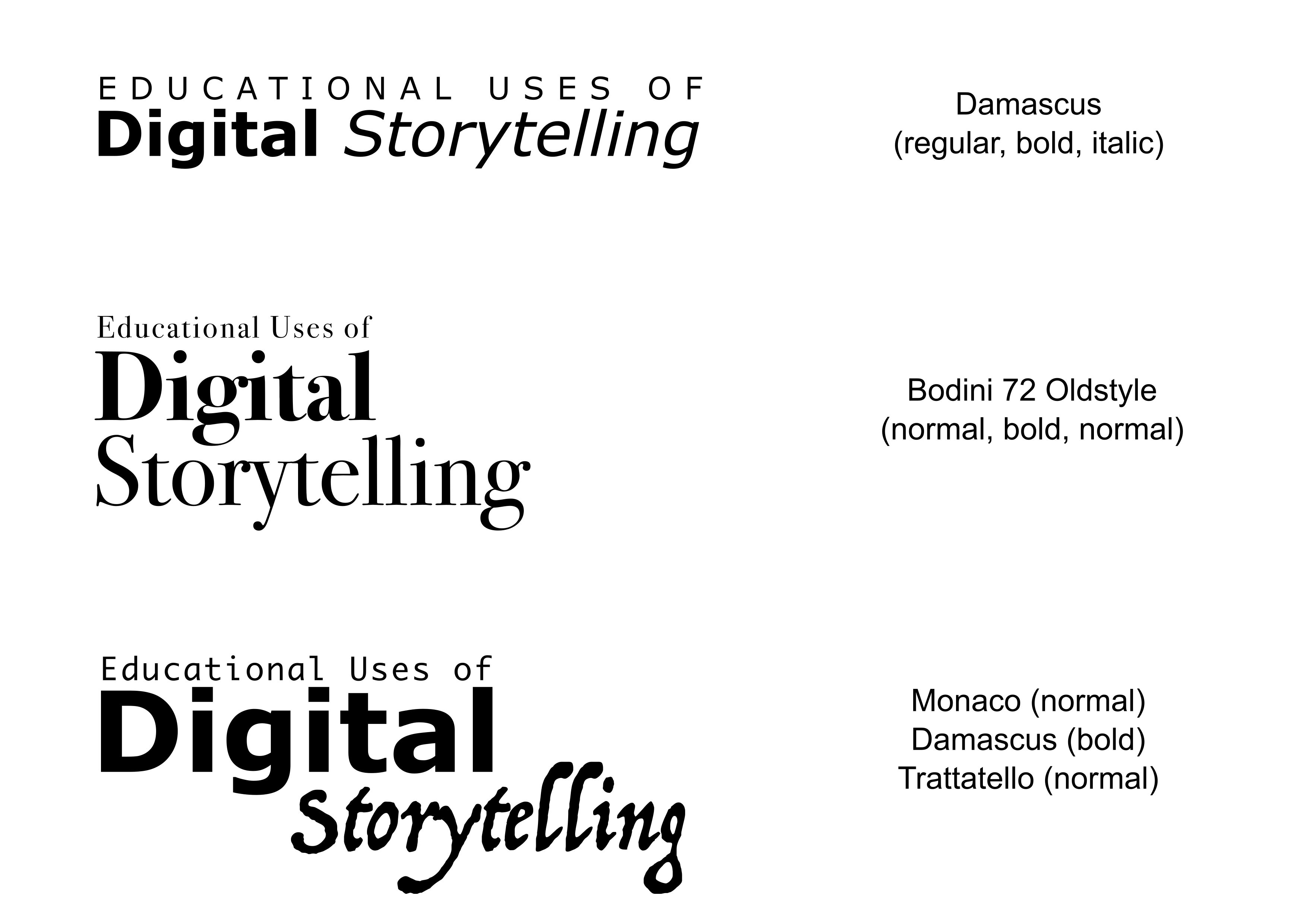
From this, I chose fonts and layouts and used Adobe Illustrator to sketch and mockup options for the wordmark (see Figure 3). I consulted with my team to select the top three wordmark design concepts, which we showed the client for a final vote (option #1 won the most votes).
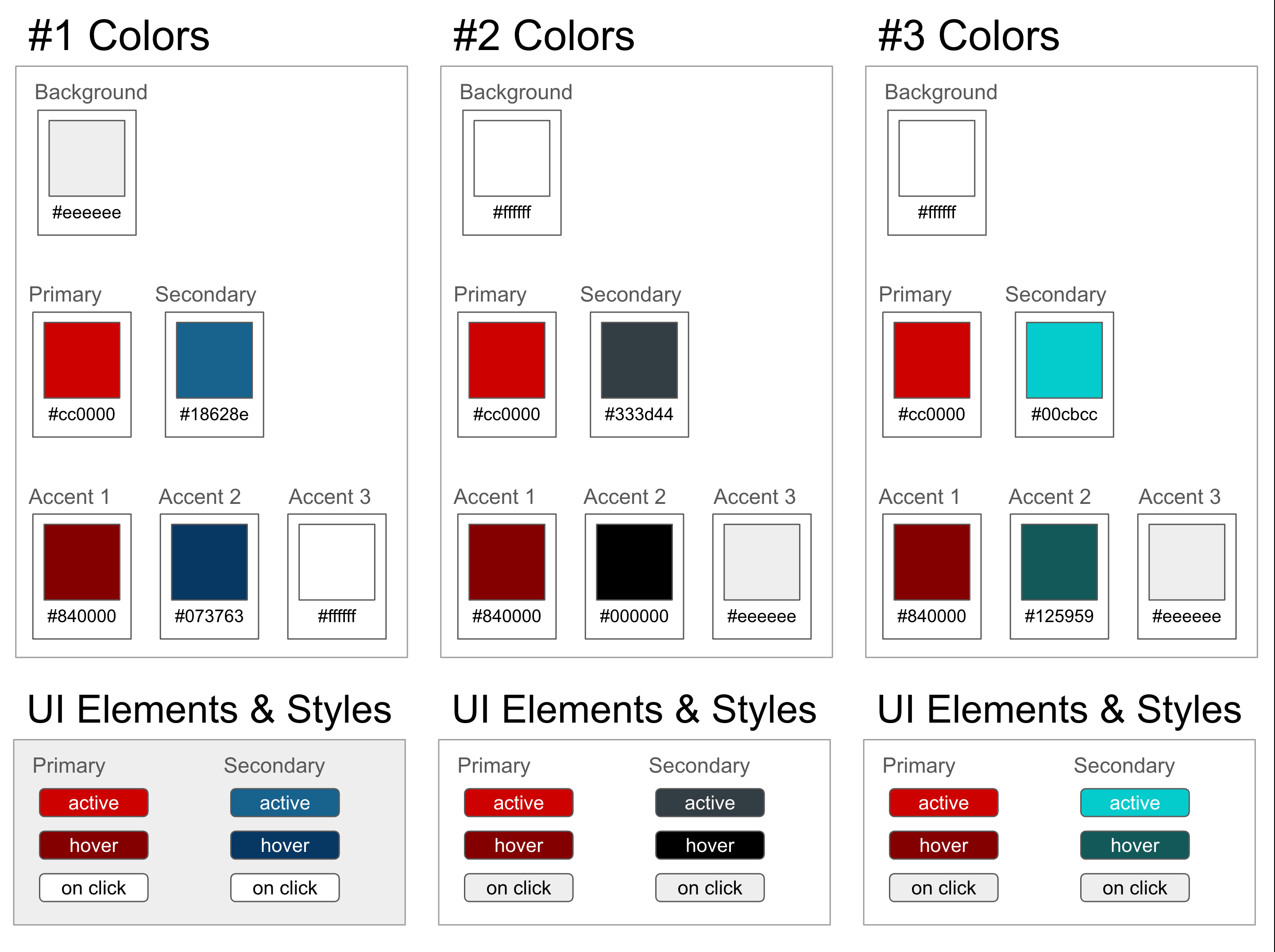
Next, I worked on the color palette options, including groupings of four colors for the primary, secondary, and accent (see Figure 4). The client requested that we work with a specific red as the focus of the palette (#cc0100). I ensured that all color palette options passed WCAG compliance with a contrast ratio of at least 4.5:1. Then I shared the color palette options with my team, they selected the top three options, and we presented them to the client for a final discussion and vote (palette #2 won the most votes).
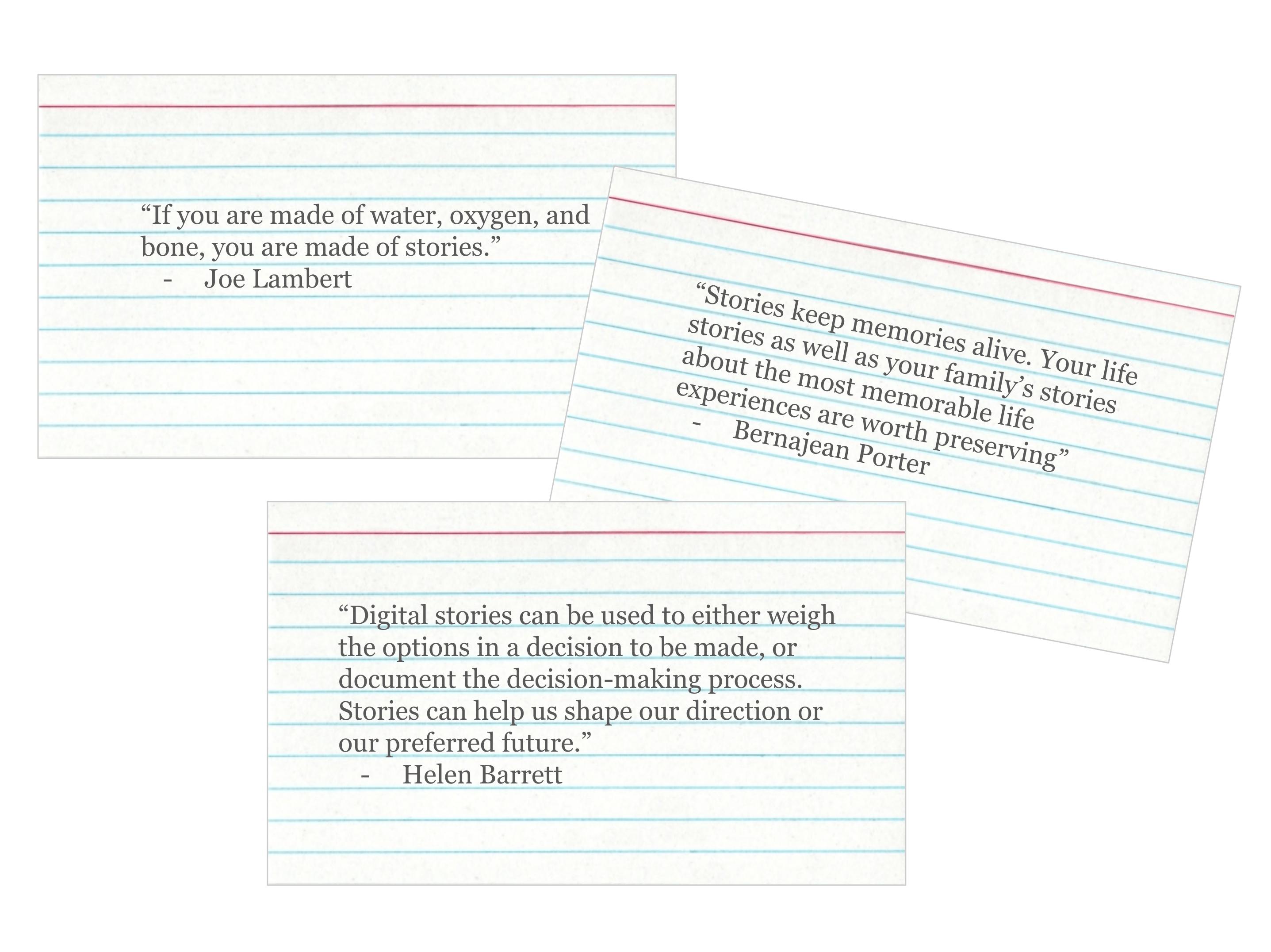
During a team brainstorming workshop we reviewed layouts other members had sketched and discussed how to address certain 508 compliance issues (e.g., replacing drop-down/flyout menus with static submenus to increase navigation for screenreaders and users with mobility impairments). Additionally, the team began discussing opportunities for new features. In addition to the primary functionality (i.e., search, filter, display videos, new submenu) one idea was to have inspiring quotes rotate across the header. I volunteered to research relevant quotes and provide options with typeface that complemented the wordmark (see Figure 5). A list of 15 quotes were selected to appear on the header upon each refresh or new page visit.
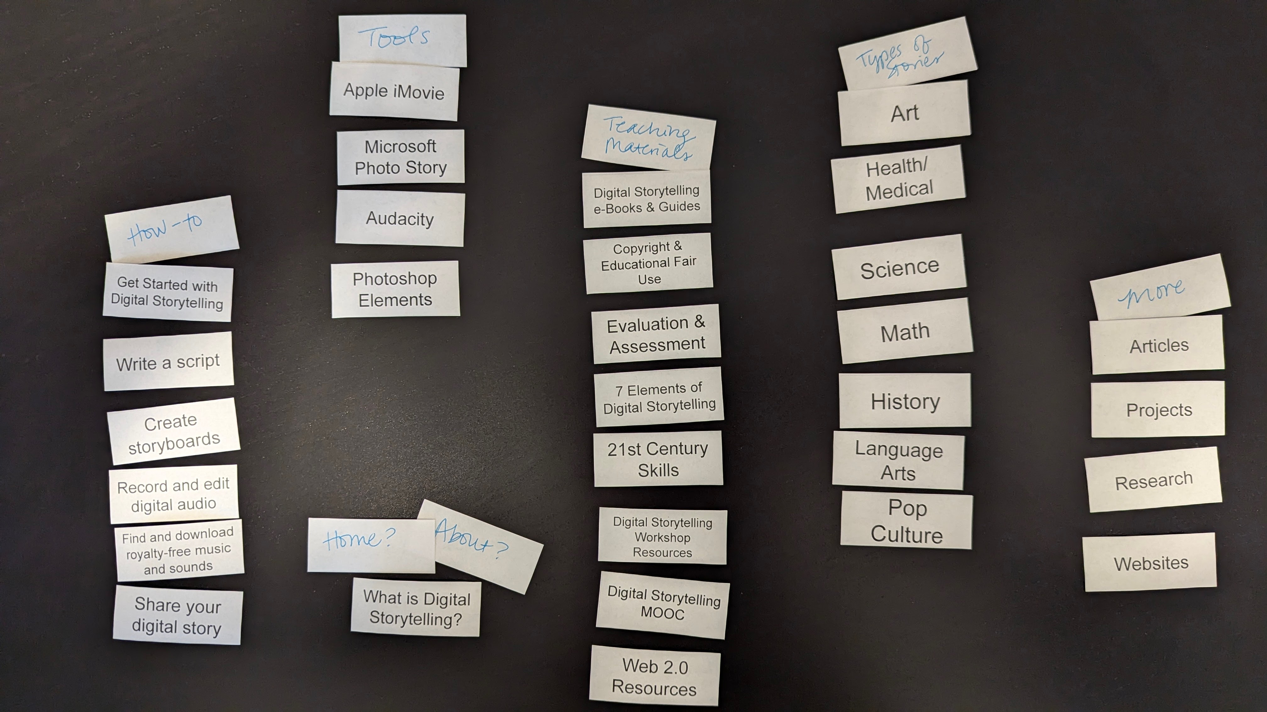
The existing information architecture consisted of eight main pages, but previous usability research indicated users were confused by the main menu microcopy and there was a low findability rate for important areas of the website (previous research found a 63% findability rate). I facilitated a moderated in-person open card sorting activity with 9 target users who had never used the website before (i.e., 4 pre-service student teachers and 5 in-service teachers). This helped us uncover users’ mental models of the website’s information architecture. Participants were given an unsorted set of 30 cards, which included educational disciplines, tool names, steps in the digital storytelling creation process, and names of resources. Then I gave the participants 10 minutes to sort the cards into groups and create their own label for each group (see Figure 6). I gave participants an additional 5 minutes to explain their groups and discuss why they created the specific labels for each group.
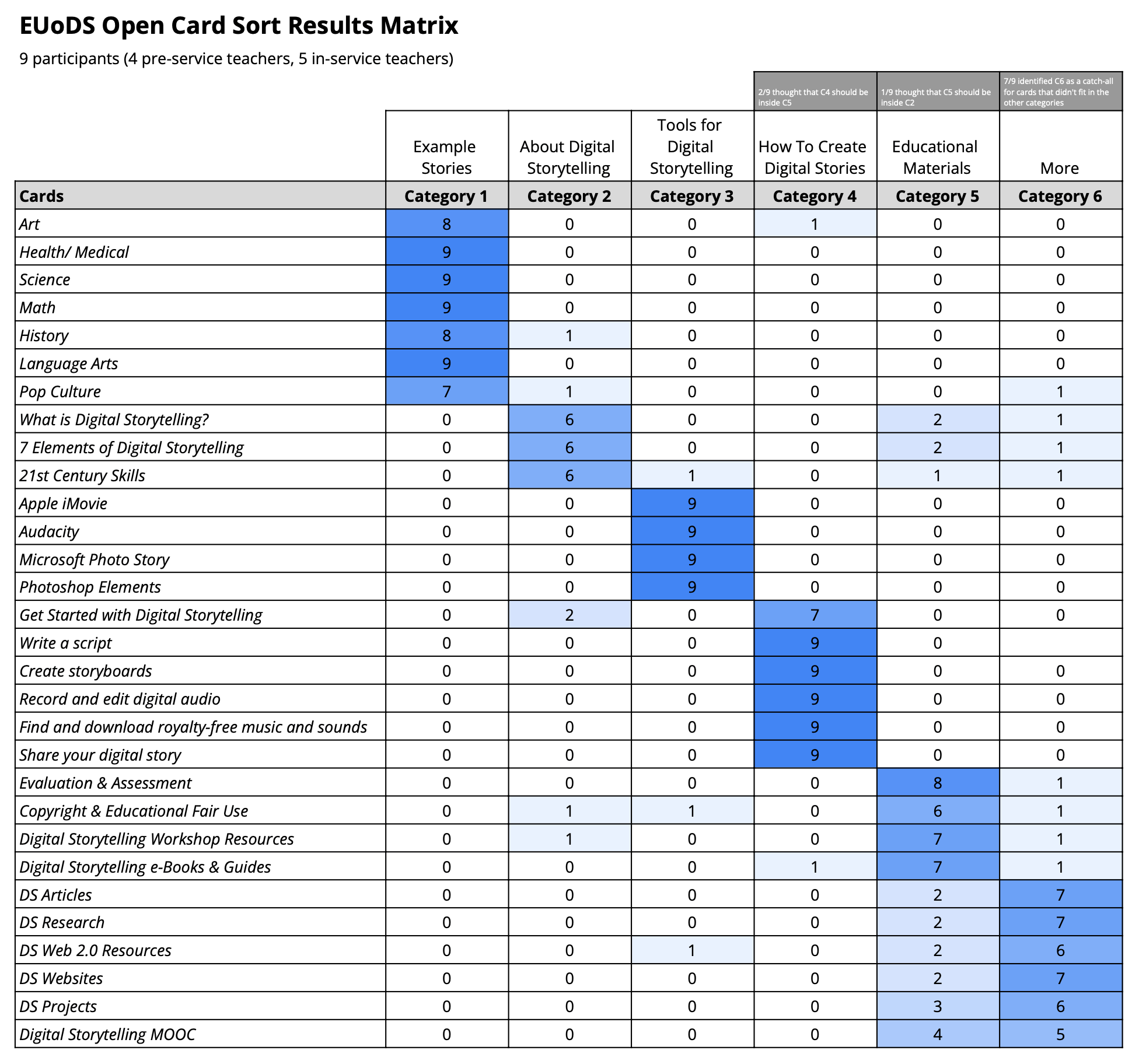
Card sort results were analyzed using a results matrix, which was created in Google Sheets (see Figure 7). Results indicated there were six categories (i.e., example stories, about digital storytelling, tools for digital storytelling, how to create digital stories, educational materials, and more). There was strong agreement for most cards; however, some participants disagreed about cards that fit into “about digital storytelling,” “educational materials”, and “more”.
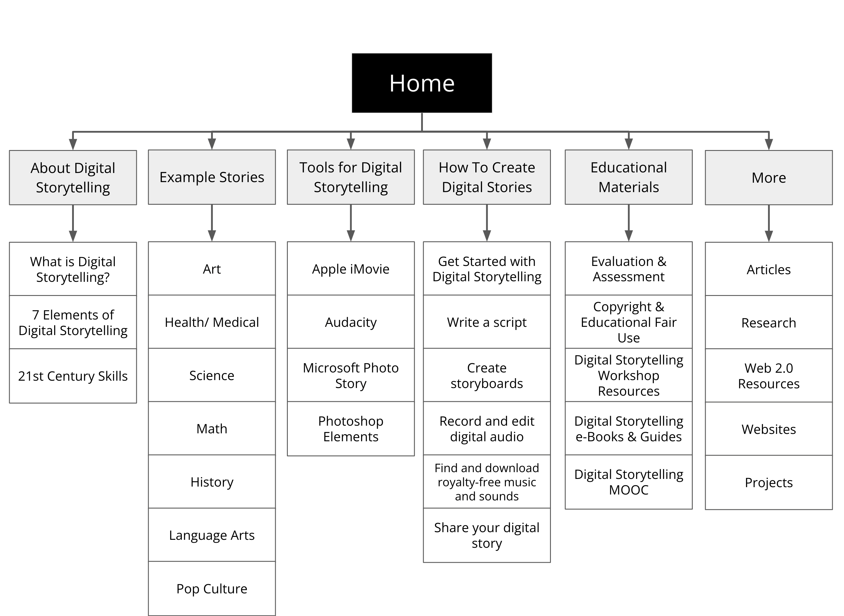
I created flowcharts to visualize the information architecture and user flow to help guide the developers with organizing content and pages (see Figure 8).
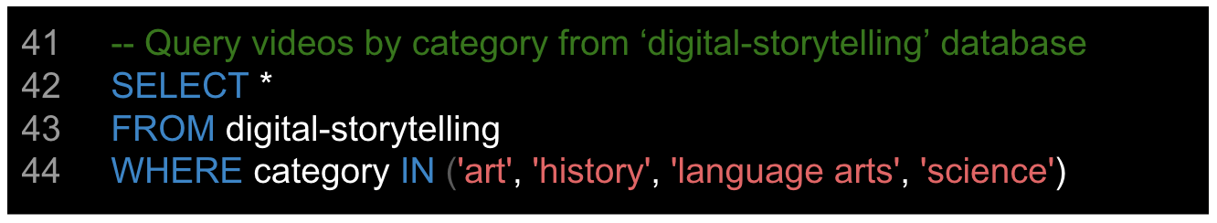
I contributed code to the project as needed, including HTML and CSS to provide front-end code for the headers, as well as back-end SQL code to organize and extract database queries for displaying the filtered video content from the ‘digital-storytelling’ database (see Figure 9). As code was developed for the project, I assisted with evaluating compliance with WCAG 2.0 guidelines throughout the development process.
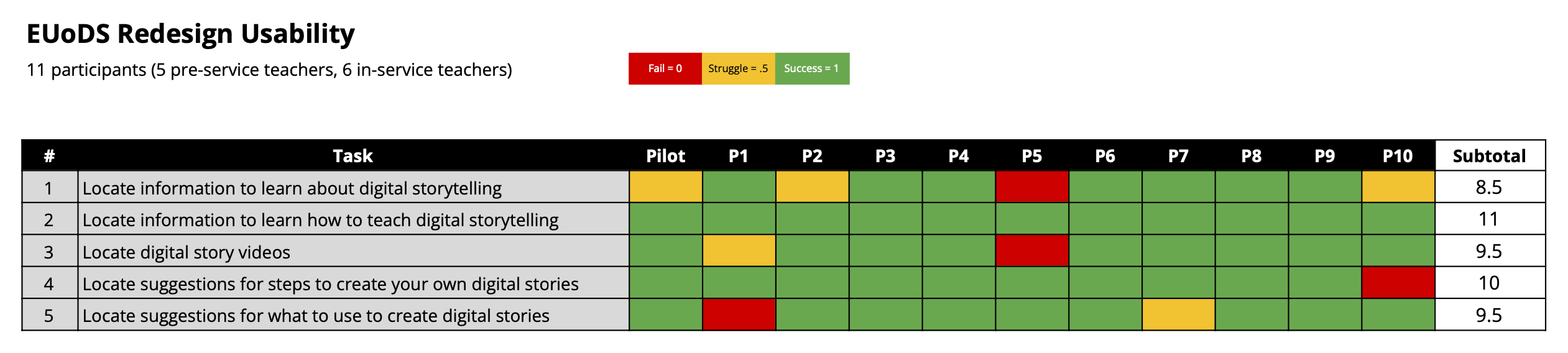
Lastly, I co-facilitated moderated in-person usability testing of the new website. This included scoping, planning, and facilitating moderated in-person usability sessions in our lab with 11 target users who had never used the website before (i.e., 5 pre-service student teachers and 6 in-service teachers). Data results indicated the findability on the redesigned website was 84%, which was a 21% increase from the previous design (prior design had a findability of 63%). A more detailed look at the findings taught us that there were 5 instances where participants struggled to complete certain tasks on the first try but they were able to self-correct. Additionally, there were only 4 fails out of 55 total task instances (see Figure 10).
Impact
I conducted a readout with the team and client, and then worked with the team to prioritize recommendations and action items to address UI bugs and resolve UX issues. Finally, the website was published and re-launched at 4 professional development workshops, which directly impacted 200+ K-12 teachers and eventually reached a broader audience of 1,000+.
